A collection of formulas for conditional formatting. Conditional Formatting in Excel
In this tutorial, we'll look at the basics of using conditional formatting in Excel.
With its help, we can highlight table values according to specified criteria, search for duplicates, and also graphically “highlight” important information.
Conditional Formatting Basics in Excel
Using conditional formatting we can:
- color the values
- change font
- set border format
It can be applied to one or several cells, rows and columns. We can configure the format using conditions. Next, we will look at how to do this in practice.
Where is conditional formatting in Excel?
The “Conditional Formatting” button is located on the toolbar, on the “Home” tab:
How to do conditional formatting in Excel?
When applying conditional formatting, the system needs to set two settings:
- Which cells do you want to format;
- Under what conditions will the format be assigned?
Below, we'll look at how to apply conditional formatting. Let's imagine that we have a table with the dynamics of the dollar exchange rate in rubles over the year. Our task is to highlight in red those data in which the exchange rate decreased in the previous month. So, let's follow these steps:
- In the data table, select the range for which we want to apply color highlighting:
- Let’s go to the “Home” tab on the toolbar and click on the “Conditional Formatting” item. In the drop-down list you will see several format types to choose from:
- Selection rules
- Rules for selecting the first and last values
- Histograms
- Color scales
- Icon Sets
- In our example, we want to highlight data with a negative value. To do this, select the type “Cell selection rules” => “Less”:
The following conditions are also available:
- Values greater than or equal to some value;
- Highlight text containing certain letters or words;
- Highlight duplicates;
- Highlight specific dates.
- In the pop-up window, in the “Format cells that are LESS than” field, specify the value “0”, since we need to highlight negative values with color. In the drop-down list on the right, select the format that meets the conditions:
- To assign a format, you can use pre-configured color palettes, or create your own palette. To do this, click on the item:
- In the format pop-up window, specify:
- fill color
- font color
- font
- cell borders
- When you complete the settings, click the “OK” button.
Below is an example of a table using conditional formatting based on the parameters we specified. Data with negative values are highlighted in red:

How to create a rule
If the pre-configured conditions are not suitable, you can create your own rules. To configure we will do the following steps:
- Let's select the data range. Click on the “Conditional Formatting” item in the toolbar. In the drop-down list, select “New Rule”:
- In the pop-up window we need to select the type of rule to apply. In our example, we will use the “Format only cells that contain” type. After this, we will set a condition to select data whose values are greater than “57” but less than “59”:
- Click on the “Format” button and set the format, as we did in the example above. Click “OK” button:

Conditional formatting based on the value of another cell
In the examples above, we set the format for the cells based on their own values. In Excel, it is possible to set a format based on values from other cells. For example, in a table with dollar exchange rate data, we can highlight cells according to the rule. If the dollar exchange rate is lower than in the previous month, then the exchange rate value for the current month will be highlighted in color.
To create a condition based on the value of another cell, follow these steps:
- Select the first cell to assign a rule. Click on the “Conditional Formatting” item on the toolbar. Let’s select the “Less” condition.
- In the pop-up window, indicate the link to the cell with which this cell will be compared. Select the format. Click the “OK” button.
- Using the left mouse button again, select the cell to which we assigned the format. Click on “Conditional Formatting”. Select “Manage Rules” from the drop-down menu => click on the “Edit Rule” button:
- In the field on the left of the pop-up window, clear the link from the “$” sign. Click the “OK” button and then the “Apply” button.
- Now we need to assign the customized format to the remaining cells of the table. To do this, select the cell with the assigned format, then in the upper left corner of the toolbar, click on the “roller” and assign the format to the remaining cells:
In the screenshot below, the data in which the exchange rate became lower compared to the previous period is highlighted in color:

How to apply multiple conditional formatting rules to one cell
It is possible to apply multiple rules to one cell.
For example, in a table with a weather forecast, we want to color the temperature indicators in different colors. Conditions for color highlighting: if the temperature is above 10 degrees - green, if above 20 degrees - yellow, if above 30 degrees - red.
To apply multiple conditions to one cell, follow these steps:
- Let's select the range with the data to which we want to apply conditional formatting => click on the “Conditional Formatting” item on the toolbar => select the selection condition “More than...” and indicate the first condition (if more than 10, then green fill). We repeat the same steps for each of the conditions (more than 20 and more than 30). Despite the fact that we applied three rules, the data in the table is colored green:
Conditional formatting is a tool in Excel that is used to assign a special format to cells or entire ranges of cells based on user-defined criteria. You will get acquainted with examples of using conditions based on complex formulas. And also learn how to manage functions such as:
- data fields;
- color palette;
- setting fonts.
Learn to work with values that can be inserted into cells based on their contents.
How to do conditional formatting in Excel
First, let's look at how to select appropriate formatting criteria and how to change them. The principle of its operation is easiest to understand using a ready-made example:
Let's say a column contains a range of cells with numeric values. If you define them with the appropriate formatting condition, then all values with a number greater than 100 will be displayed in red. To implement this task, this Excel tool will analyze, in accordance with the criteria, the value of each cell of the specified range. The analysis results give a positive result, for example (A2>100=TRUE), then the predefined new format (red color) will be assigned. In the opposite result (A2>100=FALSE), the format of the cells is not changed.
Naturally, this is a fairly simple example. You only become familiar with the power of conditional formatting when you use it in large, complex data sets where it's hard to even notice specific values. The ability to use formulas as criteria for assigning a cell format allows you to create complex conditions for quickly searching and displaying numeric or text data.
How to Create a Conditional Formatting Rule in Excel
This Excel tool provides you with 3 formatting rules that can mutually exclude values that do not meet the specified criteria. Let's look at the principle of using multiple conditions in conditional formatting using a simple example.
Let's say cell A1 contains the numeric value 50:

Let us define the following conditions for the format for displaying values in A1:
- If the number is greater than 15, the font will appear in green.
- If the number is greater than 30, the font will be displayed in yellow.
- If the number is greater than 40, the font will appear in red.
You definitely noticed that the value 50 in cell A1 matches all the conditions (A1>15, A1>30 and A1>40 = TRUE). What font color will Excel display the numeric value 50?
The answer is the following: the format will be assigned to the one that matches the last condition. And therefore it is red. It is important to remember this principle when you need to construct more complex conditions.
Note. In older versions of Excel, when defining formatting conditions, you had to focus on ensuring that the conditions did not overlap each other. This situation is most often used when the exposed data must yield to values at a certain level. But starting with Excel 2010, there are no restrictions when applying conditions.
Create a second rule
Second example. Let's say we need to format expenses in column C as follows:

All amounts between $300-$600 must have a yellow background in their cells, and amounts less than $500 must also have a red font color.
Let's try to construct these conditions:


Notice how Excel applied the formatting. The amounts in cells C10, C13, and C15 meet both conditions. Therefore, both formatting styles are applied to them. And where the value matches only one of the conditions, they are displayed in the corresponding formats.
With the release of the new version PC programs Microsoft Office has new features. The developers have improved some components and made working with the programs even more convenient. We can’t ignore Excel 2010 and its new infographic capabilities. Therefore, in this article we will use an example to tell you how to work with the new components of Excel 2010.
Conditional formatting of a table in Excel 2010
It is not always convenient to view a large number of values and compare them with planned values. Let’s assume that the monthly revenue per manager should be at least 100,000 rubles. But it is not necessary to evaluate the indicators manually by looking at each value; it is easier to trust the built-in component Excel. Let's select the data area. Go to the “Insert - Conditional Formatting - Icon Set” tab from the drop-down menu and select the template you like, I like the traffic light, as it is very convenient to work with. After selecting a template, the “Create formatting rules” window will appear in front of us. Here, opposite these very icons, you need to enter the data, if exceeded, the employee’s work is assessed as: excellent, satisfactory and unsatisfactory. The data is entered into the “Value” parameter opposite each of the circles, and the “Type” field in this case must be changed from “Percentage” to “Numbers”. I set the following parameters: 110, 90. The third parameter is set automatically, it is assessed as all values less than satisfactory. Click the “Ok” button.
Circles of three different colors appeared in the cells of all values. Based on information presented in this type, it is much easier to evaluate the work of managers over a certain period of time. We can compare the quality of work of employees, determine which employees achieve the most outstanding results, and who, on the contrary, require close attention.
But this is not the last way to conditionally format data. Infographic elements such as “Histograms” and “Color Scales” appeared. Let's look at them in more detail. Select the values in the cells and go to “Insert – Conditional Formatting – Histograms”. A list of templates will appear in the drop-down menu; when you hover over any of them, you will see a preview of the result. We select the color scheme we like and see that the cells are filled with horizontal columns of different sizes. They display graphically the values that are present in the cells. If a number is entered with a minus sign, the graph will shift in the opposite direction of the cell, indicating negative values.

The Color Scales component fills cells with the color that matches the value entered into it. For example, the smallest values will be filled in red, the middle values in yellow, and the highest values in green. The color scheme can be selected individually by you, but the essence remains approximately the same as when using the “Icon Set”.

Slices and more
But that's not all the data visualization capabilities included in the package. Let's also consider such a convenient function as “Slices”. The selected employees have worked for the company for a very impressive period of time and it is difficult to single out one or another date when creating a summary table. There are two ways to refer to a specific date. When we build a pivot table, on the right side we have elements that we can place in various fields. We turn to the “Dates” element and call up the drop-down menu by clicking on the marker with the arrow. Find the item “Filter by date”. A huge list opens with various formatting options, but we need monthly sorting. Open “All dates for the period” and select “October”. The summary table has been significantly reduced; it only contains values for October. This is the first way to sample data.

The second method is organized using the new “Slice” function, an interesting tool for analyzing digital data. Let's move on to "Insert - Slice". The “Insert slice” window opens; in it you need to mark the indicator by which the values will be sampled, that is, the table column from which you can view the slices of your report. Mark the “Dates” and click the “Ok” button. The worksheet will display a frame with the values written in it.

Let's drag it to any place convenient for us and adjust its size so that we can see all the values presented in it. You can also change the color of the slice; all templates are displayed on the top panel. Now we can select a specific date with one click and see what results the employees achieved during these days. This function is much more convenient than “Filter by date”, as it is more flexible. In it you can select several values at once to be sampled.
Infocurves
The next way to visually analyze data is infocurves. Make active the free cell opposite the rows with data. In the “Insert” tab we find the “Infocurves” section (in my version they were called “Sperklines” for some reason). Select the data range - this will be our line, and click the “Ok” button. You can see how a mini graph was built in the cell we selected; this is the info curve.

Let's extend this cell to all other lines by pulling the edge with the dot or double-clicking on it. If you wish, you can change the infocurve style; you can select it in the top panel in the infocurve designer mode. The resulting graph allows you to see the trend, trend. With a huge amount of data, the infocurve provides a general visual analysis of the entire set. It can easily be used to determine peaks and valleys, the beginning of growth or its slowdown.
There are three types of infocurves: “Graph” - this is exactly what we considered; “Column” - displays data in the form of small columns, clearly showing the maximum and minimum values; “Win/Loss” - the cell is, as it were, divided into parts, squares with negative values are placed in the lower part, squares with positive values in the upper part, zero is not displayed at all.

Conclusion
In this article, we not only learned how to quickly design a table, but also how to conduct a visual analysis of data. We also became familiar with the concept of a pivot table, learned how to filter values and conditionally format digital values, and create slices. In addition, we clearly understood the new feature called “Infocurves”. It should be noted that improvements are clearly visible, and almost all new functions are aimed at facilitating the work of a specialist and visually presenting data. If you are interested in the new functionality of the table editor, then you can contact 1CSoft partners.
Neberekutin Alexander
All rights reserved. For questions regarding the use of this article, please contact site administrators
Conditional formatting is a convenient tool for analyzing data and visually presenting results. Knowing how to use it will save a lot of time and effort. All you have to do is take a quick look at the document and you have received the necessary information.
How to do conditional formatting in Excel
The Conditional Formatting tool is located on the main page in the Styles section.
When you click on the arrow on the right, a menu for formatting conditions opens.

Let's compare the numeric values in an Excel range with a numeric constant. The most commonly used rules are “greater than / less than / equal to / between”. Therefore, they are included in the “Rules for selecting cells” menu.
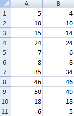
Let's enter a series of numbers into the range A1:A11:
Let's select a range of values. Open the “Conditional Formatting” menu. Select “Cell selection rules”. Let's set a condition, for example, “greater than”.
Let's enter the number 15 in the left field. In the right field - a method for highlighting values that meet the specified condition: “more than 15”. The result is immediately visible:

Exit the menu by pressing the OK button.
Conditional formatting based on the value of another cell
Let's compare the values of the range A1:A11 with the number in cell B2. Let's enter the number 20 into it.

Select the source range and open the “Conditional Formatting” tool window (abbreviated below as “UV”). For this example, we apply the “less than” condition (“Rules for selecting cells” - “Less than”).
The formatting result is immediately visible on the Excel sheet.

Values in the range A1:A11 that are less than the value in cell B2 are filled with the selected background.
Let's set a formatting condition: compare cell values in different ranges and show the same ones. We will compare column A1:A11 with column B1:B11.
Select the original range (A1:A11). Click “UV” - “Rules for selecting cells” - “Equals”. In the left field is a link to cell B1. The link should be MIXED or RELATIVE!, not absolute.

The program compared each value in column A with the corresponding value in column B. Identical values are highlighted in color.
Attention! When using relative links, you need to keep track of which cell was active when you called the Conditional Format tool. Since the link in the condition is “attached” to the active cell.
In our example, at the time the tool was called, cell A1 was active. Link $B1. Therefore, Excel compares the value of cell A1 with the value of B1. If we selected the column not from top to bottom, but from bottom to top, then cell A11 would be active. And the program would compare B1 with A11.
Compare:

To ensure that the Conditional Formatting tool performs its task correctly, keep an eye on this point.
You can check the correctness of the specified condition as follows:
- Select the first cell in the range with conditional formatting.
- Open the tool menu, click "Manage Rules".

In the window that opens, you can see which rule applies to which range.
Conditional formatting - multiple conditions
The initial range is A1:A11. It is necessary to highlight in red the numbers that are greater than 6. In green - greater than 10. Yellow - greater than 20.

Fill in the formatting parameters according to the first condition:

Click OK. We set the second and third formatting conditions in the same way.
Please note that some cell values correspond to two or more conditions at the same time. The processing priority depends on the order in which the rules are listed in the “Manager” - “Rule Management”.

That is, to the number 24, which is simultaneously greater than 6, 10 and 20, the condition “=$A1>20” (first in the list) is applied.
Conditional date formatting in Excel
Select the range with dates.
Let's apply "UV" - "Date" to it.

A list of available conditions (rules) appears in the window that opens:

Select the one you need (for example, for the last 7 days) and click OK.
The cells with the dates of the last week are highlighted in red (the date of writing the article is 02/02/2016).
Conditional formatting in Excel using formulas
If standard rules are not enough, the user can apply a formula. Almost any: the possibilities of this tool are endless. Let's consider a simple option.
There is a column with numbers. It is necessary to highlight cells with even numbers. We use the formula: =REMAT($A1,2)=0.
Select the range with numbers - open the “Conditional Formatting” menu. Select “Create Rule”. Click “Use a formula to determine the cells to format.” Fill in as follows:

To close the window and display the result – OK.
Conditional formatting of a string by cell value
Task: highlight a row containing a cell with a certain value.
Example table:

It is necessary to highlight in red the information on the project that is still in progress (“P”). Green – completed (“Z”).
Select the range with the table values. Click “UV” - “Create Rule”. The rule type is a formula. Let's use the IF function.
The procedure for filling out the conditions for formatting “completed projects”:

Similarly, we set formatting rules for unfinished projects.
In the “Dispatcher” the conditions look like this:

We get the result:

When formatting options are specified for the entire range, the condition will be executed at the same time as the cells are filled. For example, let’s “complete” Dimitrova’s project for 28.01 – we will put “Z” instead of “R”.
“Coloring” has automatically changed. Using standard Excel tools it would take a long time to achieve such results.
Lesson 8. Formatting a cell
You can change the cell format, remember it, and apply it to another table. First, let's look at the options for formatting a cell. To do this, select several cells, then right-click on them and call the mode Cell format.
As you can see, the window contains several tabs. Tab Number allows you to specify the format of the data contained in the cell. It usually rarely changes. As a rule, when entering data into a cell, the program itself determines the format. In the fieldNumber formatsyou can watch it.

Alignment tab allows you to set: where the text will be located in the cell. Suppose we typed text into a cell.

As you can see from the picture, the text is adjacent to the left border of the cell. In order to place it in the center, you need to set the parameter in the center in the field horizontally.
![]()
Interesting mode Orientation , it allows you to print text not horizontally, but in a different direction. Let's say we need to change the direction to the horizontal axis by 45 degrees. To do this, set the arrow in the field Orientation , as shown in Fig. below.


As you can see from the figure, the direction of the text has changed only in the cell to which the mode is applied. In addition, the line size has changed and become larger. The right cell contains text, and it is located at the bottom border. To install it in another location, select the second cell and use the mode Format Cells, Alignment tab. There in the field vertically set the value - along the top edge.

And the text will move higher.

An interesting mode is auto-width selection, which allows the program to automatically increase the cell size (horizontally and vertically) if the value goes beyond the existing ones. For example, let’s increase the font size to 24 in the table created in previous lessons with the auto-selection option running.

It can be seen that the vertical size (lines) has changed upward. So the lines under the table are smaller than where there is a table. Note that the type of font in the header is different, since it is increased in size (width) of the cell.
On the Font tab It is possible to set the type of font, its style, size, color, set it as strikethrough, superscript, subscript.

In the example shown above, let's set the font of the same style in the title (Arial), set it to bold, make it underline and choose blue. To do this, select the header cells and set the parameters as shown below.

In the Sample field you can see how the text will look.

Now let’s select the table header again, uncheck the auto-fit width option, and get the following image.

As you can see, the text overlaps the text of other cells. Let's use the mode Format on the Home tab.

In the panel that appears, select the modeAutomatic text width. We get:

On the Border tab, you can set borders around the cell. Let's say we have several cells, as shown in Fig. below.

Let's select them and use the tab Border.

We chose the color - orange, the line type - double and pressed the button external.

Now let's select the table again and use the tab again Border.

We selected a different color, line type and clicked on the internal button. You could not leave the border setting mode, set the color, line type, press the button external, then change the line type, color and click on the button internal.

Fill tab allows you to set the cell fill. Select the previous cells again and set the color. You can select a color and then the cells will be painted with a uniform color, but we chose Pattern and the color of the pattern.


Preserving cell style . Let's assume that we will use the resulting style when creating the following tables. Therefore, select four cells again and click on the button Cell styles on the Home tab.

There are already styles installed in the program, but we need to create our own style. So let's click on the inscriptionCreate a cell style.

A window will appear on the screen in which there are elements for which you can create your own style, let's call it Try. Check all the checkboxes and click on the button OK . Now the new style will be remembered in the program and when we call the mode Cell styles , then it will appear in the list Custom.

Then, when you need to use the new style, select the cells and use the Try . After this, the new table will take on your new style.
Sometimes you need to highlight numbers depending on certain conditions. So, if the table presents comparative data on categories of the population that abuse certain products, then it is better to highlight people who are prone to alcoholic beverages in italic font, vegetarians who eat food from garden beds - in underlined font, and those who consume uncontrollably large amounts of food - in bold font. In addition, the use of a color format may be dictated by certain conditions. For example, if the temperature in an apartment in winter does not rise above 0, then it is better to show the number of such apartments in blue, at a temperature of 0 - 10 degrees - in green, in the range of 10 - 20 degrees - in yellow, and above 30 degrees - in red.
Let's return to the table we created earlier. Let's select a part of the table with numerical values and use the mode on the tab Home → Conditional Formatting. A mode window will appear on the screen, the appearance of which is shown in the figure. In this window, select the mode Create a rule.

A window will appear in which we set the values for the rules.

Let's set the task to have the background color of the cells depending on their value. Let's choose the top rule Format all cells based on their values and click on the button OK .

If we change the color to blue, we get the following table.

Select the format style mode - three-color scale and press the button OK .


In these modes, you can change the average value by entering the value using the keyboard, but you can also specify the cell in which this value is located by pressing the - button.
You can set the value histogram. Then the cells will be filled with the specified color depending on their value.

You can set icons next to values using the icon sets mode.

You can perform conditional formatting not on the entire table, but on part of it. There are other modes as well. For example,Conditional Formatting→ Cell selection rules→ Between .

In the window, all values that are between 25 and 72 will be highlighted with a light red fill and a dark red color. These values can be changed by entering them using the keyboard.

In the list of values to which you can change the format, there is a custom format where you can change the font type, style, etc. For example, you can make the style bold.

Note that you can use multiple rules for one table.