How to build a chart in Excel. How to Make a Pie Chart in Excel
This tutorial covers the basics of working with charts in Excel and is detailed instructions by their construction. You'll also learn how to combine two chart types, save a chart as a template, change the default chart type, resize, or move a chart.
Excel charts are essential for visualizing data and monitoring current trends. Microsoft Excel provides powerful functionality for working with diagrams, but finding the right tool can be difficult. Without a clear understanding of what types of graphs there are and for what purposes they are intended, you can spend a lot of time fiddling with various elements of the chart, and the result will have only a vague resemblance to what was intended.
We'll start with the basics of charting and step by step to create a chart in Excel. And even if you are new to this business, you can create your first chart within a few minutes and make it exactly as you need.
Excel Charts - Basic Concepts
A chart (or graph) is a graphical representation of numerical data, where information is represented by symbols (bars, columns, lines, sectors, and so on). Graphs in Excel are typically created to make large amounts of information easier to understand or to show relationships between different subsets of data.
Microsoft Excel allows you to create many various types charts: bar chart, histogram, line chart, pie and bubble chart, scatter and stock chart, donut and radar chart, area chart and surface chart.
IN Excel charts there are many elements. Some of them are displayed by default, others, if necessary, can be added and configured manually.

Create a chart in Excel
To create a chart in Excel, start by entering numerical data into a worksheet, and then follow these steps:
1. Prepare data for charting
Most Excel charts (such as histograms or bar charts) do not require a special arrangement of the data. The data can be in rows or columns, and Microsoft Excel will automatically suggest the most appropriate graph type (you can change this later).
To make a beautiful chart in Excel, the following points may be helpful:
- The chart legend uses either the column headings or the data from the first column. Excel automatically selects data for the legend based on the location of the source data.
- The data in the first column (or column headers) is used as the x-axis labels in the chart.
- The numeric data in the other columns is used to create the y-axis labels.
For example, let's build a graph based on the following table.

2. Choose what data you want to show on the graph
Select all the data you want to include in your Excel chart. Select the column headings you want to appear in the chart legend or as axis labels.
- If you want to plot a graph based on adjacent cells, you can simply select one cell and Excel will automatically add all adjacent cells that contain data to the selection.
- To create a graph based on data in nonadjacent cells, select the first cell or range of cells, then press and hold Ctrl, select the remaining cells or ranges. Please note that you can only plot from non-adjacent cells or ranges if the selected area forms a rectangle.
Advice: To select all used cells in a worksheet, place the cursor in the first cell of the used area (click Ctrl+Home to go to cell A1), then click Ctrl+Shift+End to expand the selection to the last used cell (lower right corner of the range).
3. Paste the chart into an Excel sheet
To add a graph to the current sheet, go to the tab Insert(Insert) section Diagrams(Charts) and click on the icon the right type diagrams.
In Excel 2013 and Excel 2016, you can click Recommended Charts(Recommended Charts) to view a gallery of ready-made charts that work best for your selected data.

IN in this example, we create a volumetric histogram. To do this, click on the arrow next to the histogram icon and select one of the chart subtypes in the category Volume histogram(3D Column).

To select other chart types, click the link Other histograms(More Column Charts). A dialog box will open Inserting a chart(Insert Chart) with a list of available histogram subtypes at the top of the window. At the top of the window, you can select other chart types available in Excel.

Advice: To immediately see all available chart types, click the button View all charts Diagrams(Charts) tab Insert(Insert) Menu ribbons.

In general, everything is ready. The diagram is inserted into the current worksheet. This is the volumetric histogram we got:

The graph already looks good, but there are still a few tweaks and improvements that can be made, as described in the section.
Create a Combo Chart in Excel to Combine Two Chart Types
If you want to compare different types of data in an Excel chart, you need to create a combination chart. For example, you can combine a histogram or surface chart with line graph to display data with very different dimensions, such as total revenue and units sold.
In Microsoft Excel 2010 and later earlier versions creating combination charts was a time-consuming task. Excel 2013 and Excel 2016 solve this task in four simple steps.

Finally, you can add some finishing touches, such as the chart title and axis titles. The finished combo chart might look something like this:

Customizing Excel Charts
As you have already seen, creating a chart in Excel is not difficult. But after adding a chart, you can change some of the standard elements to create an easier-to-read chart.
In the most recent Microsoft versions Excel 2013 and Excel 2016 have significantly improved work with charts and added new way access chart formatting options.
In general, there are 3 ways to customize charts in Excel 2016 and Excel 2013:

To access additional parameters click the icon Chart elements(Chart Elements), find the element you want to add or change in the list and click the arrow next to it. The chart settings panel will appear to the right of the worksheet, here you can select the desired parameters:

We hope that this brief overview chart customization features helped you get a general idea of how you can customize charts in Excel. In the following articles, we'll take a closer look at how to customize various chart elements, including:
- How to move, adjust, or hide a chart legend
Saving a chart template in Excel
If you really like the created chart, you can save it as a template ( .crtx file) and then use this template to create other charts in Excel.
How to create a chart template

In Excel 2010 and earlier, the function Save as template(Save as Template) is located on the Menu Ribbon tab Constructor(Design) in the section Type(Type).


By default, the newly created chart template is saved in special folder Charts. All chart templates are automatically added to the section Templates(Templates) that appears in dialog boxes Inserting a chart(Insert Chart) and Changing the chart type(Change Chart Type) in Excel.
Please note that only those templates that were saved in the folder Charts will be available in the section Templates(Templates). Make sure you do not change the default folder when saving the template.
Advice: If you downloaded chart templates from the Internet and want them to be available in Excel when you create a chart, save the downloaded template as .crtx file in folder Charts:
C:\Users\Username\AppData\Roaming\Microsoft\Templates\Charts
C:\Users\Username\AppData\Roaming\Microsoft\Templates\Charts
How to use a chart template
To create a chart in Excel from a template, open the dialog box Inserting a chart(Insert Chart) by clicking the button View all charts(See All Charts) in the lower right corner of the section Diagrams(Charts). On the tab All diagrams(All Charts) go to section Templates(Templates) and select the one you need from the available templates.

To apply a chart template to an already created chart, right-click on the chart and select from the context menu Change chart type(Change Chart Type). Or go to the tab Constructor(Design) and press the button Change chart type(Change Chart Type) in section Type(Type).

In both cases a dialog box will open Changing the chart type(Change Chart Type), where in the section Templates(Templates) you can select the desired template.
How to Delete a Chart Template in Excel
To delete a chart template, open the dialog box Inserting a chart(Insert Chart), go to section Templates(Templates) and click the button Template management(Manage Templates) in the lower left corner.

Pressing a button Template management(Manage Templates) will open the folder Charts, which contains all existing templates. Right-click the template you want to delete and select Delete(Delete) in the context menu.
Using the default chart in Excel
Excel's default charts are a huge time saver. Whenever you need to quickly create a chart or just look at trends in your data, creating a chart in Excel is literally a keystroke away! Simply select the data to be included in the chart and press one of the following keyboard shortcuts:
- Alt+F1 to insert a default chart in the current worksheet.
- F11 to create a default chart in a new worksheet.
How to Change the Default Chart Type in Excel
When you create a chart in Excel, the default chart is a regular histogram. To change the default chart format, follow these steps:

Resize a chart in Excel
To resize Excel charts, click on it and use the handles on the edges of the diagram to drag its borders.

Another way is to enter the desired value in the fields Figure height(Shape Height) and Figure width(Shape Width) in the section Size(Size) tab Format(Format).

To access additional options, click the button View all charts(See All Charts) in the lower right corner of the section Diagrams(Charts).

Moving a chart in Excel
When you create a graph in Excel, it is automatically placed on the same sheet where the source data is located. You can move the chart anywhere on the sheet by dragging it with the mouse.
If it is easier for you to work with a schedule on separate sheet, you can move it there like this:

If you want to move the chart to an existing sheet, select the option On an existing sheet(Object in) and select the required sheet from the drop-down list.
To export a chart outside of Excel, right-click the chart border and click Copy(Copy). Then open another program or application and paste the chart there. You can find several more ways to export charts in this article -.
This is how charts are created in Excel. I hope you found this overview of the basic charting features helpful. In the next lesson, we will look in detail at the features of setting up various chart elements, such as the chart title, axis titles, data labels, and so on. Thank you for your attention!
In our life we simply cannot do without various comparisons. Numbers are not always easy to understand, which is why people came up with diagrams.
The most convenient program for plotting various types-Microsoft Office Excel. That's what Excel will be about in this article.
This process is not that complicated, you just need to follow a certain algorithm.
Open the document: “Start” button - “Entire list of programs” - folder “ Microsoft Office" - Excel document.
We create a table of the data desired for visual reproduction in the diagram. Select a range of cells containing numeric data.
Call the “Graphs and Charts Wizard”. Commands: “Insert” - “Diagram”.

Chart wizards will appear on the screen. He will help you decide, But for this work you need to follow four simple steps.
The first step is to select the chart type. As you can see from the list that opens, there is a wide variety of these types: area graph, bubble chart, histogram, surface, and so on. Custom chart types are also available for selection. You can see an example of a graphical display of the future graph in the right half of the window.
The second step in order to answer the question in Excel is to enter the data source. We are talking about the very sign that was mentioned in the second paragraph of the first part of the article. On the “Series” tab, it is possible to specify the name of each series (table column) of the future chart.
The most voluminous item No. 3: “Chart parameters”. Let's go through the tabs:
Headings. Here you can set labels for each axis of the chart and give it a name.
Axles. Allows you to select the type of axes: time axis, category axis, automatic detection type.
Grid lines. Here you can set or, conversely, remove the main or intermediate lines of the chart grid.
Legend. Allows you to show or hide the legend and select its location.
Data table. Adds a data table to the plotting area of the future chart.
Data signatures. Includes data labels and provides a choice of separator between measures.
The last and shortest step to creating a chart in Excel is choosing the location of the future graph. There are two options to choose from: the original sheet or a new sheet.
After all the required fields dialog boxes The diagram wizards are completed, feel free to click the “Finish” button.
Your creation appears on the screen. And although the Chart Wizard allows you to view the future chart at each stage of its work, eventually you still need to correct something.
For example, by right-clicking a couple of times in the chart area (but not on the chart itself!), you can make the background on which the chart is located colored or change the font (style, size, color, underline).
At double click With the same right-click on the chart lines, you can format the grid lines of the chart itself, set their type, thickness and color, and change many other parameters. The construction area is also available for formatting, or rather, for color design.

We hope that you received the most clear and simple answer to your question: “How to make a chart in Excel?” Everything is very simple if you follow the instructions above. We wish you success!
The Microsoft Excel spreadsheet processor is a universal tool for working with tables. Summary reports, price lists, catalogs and much more using functions to solve everyday problems - all this is Excel. Dry numbers on the screen – only values and indicators; diagrams are used for visual display.
Run required file, book or Excel sheet. Or create new document via the right-click menu. After launch it will open working window programs. In the working window, select the area from which you want to create a diagram. If you need to display labels for values, then the entire table is selected. Otherwise only values. There are several types of diagrams, determine the most suitable visual design for yourself:- Histogram;
- Schedule;
- Circular;
- Ruled;
- With areas;
- Spot;
- Exchange;
- Surface;
- Petal;
- Combined.
Hello dear reader!
This article will talk about how the information displayed in a chart can tell the user much more than a bunch of tables and numbers; you can visually see how and what your chart displays.
Graphs and Charts in Excel take up enough significant place, since they are one of the best tools for data visualization. It’s rare that a report can do without diagrams; they are especially often used in presentations.
With just a few clicks you can create a diagram, sign it and see with your own eyes all the current information in an accessible visual format. To make it convenient, the program has a whole section that is responsible for this with an extensive group of tabs "Working with diagrams".
And now, in fact, I think it’s worth telling, and let’s look at it step by step:
Create charts in Excel
Where does it actually begin? First of all, we need initial data, based on which the diagram itself is built. Let's look at it step by step:
- you select the entire table, along with the labeled columns and rows;
- select a tab "Insert", go to block "Diagrams" and select the type of chart you want to create;

Selecting and changing a chart type
If you have created a diagram that does not meet your requirements, then at any time you can select the type of diagram that best meets your requirements.
To select and change the chart type:
- first, select your entire table again;
- secondly, go to the tab "Insert", let's go to the block again "Diagrams" and change the chart type from the proposed options;

Replacing rows and columns in a chart
Very often when it happens creating charts in Excel There is confusion and confusion or simply because the wrong thing was indicated. This error can be easily fixed in just a couple of steps:

Changing the chart title
So, we have created the diagram, but this is not the last step, because we must name it so that not only we, after some time, know what we are talking about, but also those who will use the diagram we created. So, changing the diagram happens very quickly, in just a couple of clicks:

Working with a chart legend
The next step is to create a legend for our diagram. Legend is a description of the information that is in the diagram. Typically, by default, the legend is automatically placed on the right side of the chart. Create a legend for a chart can be done as follows:

Data Labels in a Chart
Create charts in Excel ends with the last stage of working with the diagram, this is the data signature. These you will be able to focus attention on some point with data or on a group of data. The signature will help you freely operate with the received data. You can do it like this.
Excel is one of the most best programs for working with tables. Almost every user has it on their computer, since this editor is needed both for work and for study, while performing various coursework or laboratory assignments. But not everyone knows how to make a chart in Excel using table data. In this editor you can use a huge number of templates that were developed by Microsoft. But if you do not know which type is better to choose, then it would be preferable to use automatic mode.
In order to build such an object, you must perform the following steps.
- Create some table.

- Highlight the information on which you are going to build a chart.

- Go to the "Insert" tab. Click on the "Recommended Charts" icon.

- You will then see the Insert Chart window. The options offered will depend on what exactly you select (before clicking the button). Yours may be different, since everything depends on the information in the table.

- In order to build a diagram, select any of them and click on “OK”.

- IN in this case the object will look like this.

Manually selecting a chart type
- Select the data you need for analysis.

- Then click on any icon from the specified area.

- Immediately after this, a list of different object types will open.

- By clicking on any of them, you will get the desired diagram.

To make it easier to make a choice, just point at any of the thumbnails.
What types of diagrams are there?
There are several main categories:
- histograms;

- graph or area chart;

- pie or donut charts;

Please note that this type suitable for cases where all values add up to 100 percent.
- hierarchical diagram;

- statistical chart;

- dot or bubble plot;

In this case, the point is a kind of marker.
- waterfall or stock chart;

- combination chart;
If none of the above options suits you, you can use combined options.

- superficial or petal;

How to make a pivot chart
This tool is more complex than those described above. Previously, everything happened automatically. All you had to do was choose appearance and the desired type. Everything is different here. This time you will have to do everything manually.
- Select the required cells in the table and click on the corresponding icon.

- Immediately after this, the “Create PivotChart” window will appear. You must specify:
- table or range of values;
- the location where the object should be placed (on a new or current sheet).
- To continue, click on the “OK” button.

- As a result of this you will see:
- empty pivot table;
- empty diagram;
- Pivot chart fields.

- You need to drag the desired fields into the areas with the mouse (at your discretion):
- legends;
- values.

- In addition, you can configure exactly what value you want to display. To do this, right-click on each field and click on “Value Field Options...”.

- As a result, the “Value Field Options” window will appear. Here you can:
- sign the source with your estate;
- Select the operation that should be used to roll up the data in the selected field.
To save, click on the “OK” button.

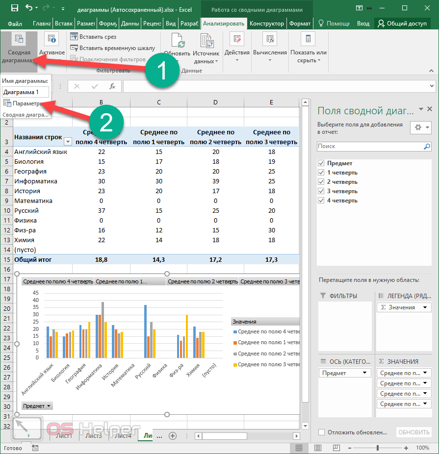
Analyze tab
Once you have created your PivotChart, you will be presented with new tab"Analyze". It will immediately disappear if another object becomes active. To return, just click on the diagram again.

Let's look at each section more carefully, since with their help you can change all elements beyond recognition.
PivotTable Options
- Click on the very first icon.
- Select "Options".
- This will open the settings window. of this object. Here you can set the desired table name and many other parameters.

To save the settings, click on the “OK” button.
How to change the active field
If you click on this icon, you will see that all tools are not active.

In order to be able to change any element, you need to do the following.
- Click on something on your diagram.

- As a result, this field will be highlighted in circles.
- If you click on the “Active Field” icon again, you will see that the tools have become active.

- To make settings, click on the appropriate field.

- As a result, the “Field Options” window will appear.

- For additional settings go to the "Markup and Print" tab.

- To save changes made, you must click on the “OK” button.
How to insert a slice
If you wish, you can customize the selection based on certain values. This feature makes it very convenient to analyze data. Especially if the table is very large. In order to use this tool, you need to take the following steps:
- Click on the “Insert Slice” button.
- As a result, a window will appear with a list of fields that are in the pivot table.

- Select any field and click on the “OK” button.

- As a result of this, a small window will appear (it can be moved to any convenient place) with all unique values(summary summary) for this table.

- If you click on any line, you will see that all other entries in the table have disappeared. All that remains is where the average value matches the selected one.

That is, by default (when all lines are selected in the slice window blue) the table displays all values.
- If you click on another number, the result will immediately change.

- The number of lines can be absolutely any (minimum one).

It will change like pivot table, and a diagram that is built according to its values.
- If you want to delete a slice, you need to click on the cross in the upper right corner.

- This will restore the table to its original form.

In order to remove this slice window, you need to take a few simple steps:
- Right-click on this element.
- After this it will appear context menu, in which you need to select the “Delete ‘field name’” item.

- The result will be as follows. Please note that the panel for setting the fields of the pivot table has again appeared on the right side of the editor.

How to insert a timeline
In order to insert a slice by date, you need to take the following steps.
- Click on the appropriate button.

- In our case, we will see the following error window.

The point is that to slice by date, the table must have the appropriate values.
The operating principle is completely identical. You will simply filter the output of records not by numbers, but by dates.
How to update data in a chart
To update information in the table, click on the corresponding button.

How to change build information
To edit a range of cells in a table, you must perform the following operations:
- Click on the “Data Source” icon.
- In the menu that appears, select the item of the same name.

- Next, you will be asked to specify the required cells.
- To save the changes, click on “OK”.

Editing a chart
If you are working with a chart (no matter which one - regular or summary), you will see the “Design” tab.

There are a lot of tools on this panel. Let's take a closer look at each of them.
Add element
If you wish, you can always add some object that is missing in this diagram template. To do this you need:
- Click on the “Add chart element” icon.
- Select the desired object.

Thanks to this menu you can change your chart and table beyond recognition.
If standard template When you create a chart you don't like, you can always use other layout options. To do this, just follow these steps.
- Click on the appropriate icon.
- Select the layout you need.

You don't have to make changes to your object right away. When you hover over any icon, a preview will be available.

If you find something suitable, just click on this template. The appearance will automatically change.
To change the color of the elements, you must follow these steps.
- Click on the corresponding icon.
- As a result of this, you will see a huge palette of different shades.

- If you want to see what this will look like on your chart, just hover over any of the colors.

- To save changes, you need to click on the selected shade.
In addition, you can use ready-made themes registration To do this you need to do a few simple operations.
- Expand full list options for this tool.

- In order to see how it looks in an enlarged form, just hover over any of the icons.

- To save changes, click on the selected option.
In addition, manipulations with the displayed information are available. For example, you can swap rows and columns.

After clicking this button, you will see that the diagram looks completely different.
This tool is very helpful if you cannot correctly specify the fields for rows and columns when building a given object. If you make a mistake or the result looks ugly, click on this button. Perhaps it will become much better and more informative.

If you press again, everything will go back.

In order to change the range of data in the table for plotting a chart, you need to click on the “Select data” icon. In this window you can
- select the required cells;
- delete, change or add rows;
- edit the horizontal axis labels.

To save the changes, click on the “OK” button.
How to change chart type
- Click on the indicated icon.
- In the window that appears, select the template you need.

- When you select any of the items on the left side of the screen, on the right will appear possible options to build a diagram.

- To simplify your selection, you can hover over any of the thumbnails. As a result, you will see it in an enlarged size.

- To change the type, you need to click on any of the options and save using the “OK” button.
Conclusion
In this article, we took a step-by-step look at the technology for constructing diagrams in Excel editor. In addition, special attention was paid to the design and editing of created objects, since it is not enough to be able to use only ready-made options from Microsoft developers. You must learn to change the appearance to suit your needs and be original.
If something doesn't work for you, you may be highlighting the wrong element. It must be taken into account that each figure has its own unique properties. If you were able to modify something, for example, with a circle, then you won’t be able to do the same with the text.
Video instructions
If for some reason nothing works out for you, no matter how hard you try, a video has been added below in which you can find various comments on the actions described above.