Beautiful menu for a VKontakte group. How to make a graphic menu on VKontakte
I think everyone who actively uses the VKontakte social network has already come across beautifully designed groups and public pages. Many of them, in addition to the menu, also have many stylized sub-pages, catalogs, etc., which essentially creates a small website right inside the social network.
Here are a few examples so everyone understands what we are talking about.


Such groups allow you to stand out among your competitors and attract more users. Especially if the content is also interesting :)
In this article we will talk about how this is all done. To analyze everything in more detail and delve into all the subtleties, let’s take a specific example. There will be a small master class on group design.
The very first stage of our work is the idea. We need to understand what we want to tell and to whom. There are several community formats in VKontakte, and you should choose based on your goals. Although in the future the group can be transferred to a public format and vice versa.
I explain with my fingers. Public- this is something like a blog. News feed. In other words, we tell our subscribers about certain things and they will not be able to write on the wall of our community. The maximum is to comment.
Group allows you to create a community more open to conversation and discussion, where people can make posts in the feed on their own behalf. You can also add friends from your list to it. There is no such option in public. In addition, the group has a little more options for integrating wiki markup (there is a “News” section into which you can integrate a menu).
Globally, we can think like this: if we need to create a community for a store, then I would take the “public” format. If we are talking, for example, about fishing enthusiasts, then it is better to take a “group”. Although, everyone is free to do as they see fit. After all, the format can be changed at any time. However, keep in mind that VKontakte introduces a restriction on changing the community format again and after the first time you will need to wait several days until you can return everything back if necessary. Therefore, it is better to test the functionality before the group begins to fill with content.
As part of this master class, I will take as a starting point the game Mad Max based on the film of the same name, which was released just a couple of weeks ago, and will create a community for players with various materials on this game. The main goal is to drain traffic to your gaming site.
The format will be “Group”, as it is necessary to create a natural influx of audience and maximize communication within the community. I’ll clarify right away what I’ll be using. universal technique, which can be used both in group format and in public. This works everywhere.
There is a lot of content, let's start bringing the idea to life!
Create a group
To create a group, go to “My Groups” in the right menu of your VKontakte account and click on the blue button at the top “Create a community”.

A window like this should appear, where we enter the name for our group and select the format.

By entering necessary information The control panel of our community opens in front of us. In my case it looks like this.

As you can see, I added a few parameters: I included video, audio recordings, discussions and a number of other features that will be useful to me in further work when collecting content. All this can be changed in the future without any restrictions. I also wrote down the address of my website. If you don’t have a website, or its topic does not correspond to the format of the community (they are about different things and are in no way related to each other), then this line can be left empty.
I set age restrictions at in this case from 18, similar to those that the developers set for the game. Although I have little doubt that children also play.
All. The group has been created!

Now you can start to design it.
Formatting a VKontakte group
This stage can be divided into 2 components: graphic and technical. To work, we will need a template for creating a group avatar and menu, as well as a little imagination and basic knowledge of Photoshop (aka Adobe Photoshop).
Markup template
What is a template and what is it even? A template is a kind of blank. In this case, in *. psd format We have marked areas for the picture under the menu and the group avatar.

As you can see in the second example at the beginning of this article, we can make the design in uniform style for avatar and menu picture. At the same time, it is visually cut into 2 parts. So, the template allows you to form an image in such a way as to eliminate the displacement of graphics and fit the pictures to the same level as much as possible.
To make it clearer, here is an example.

We see that in both parts of the picture there is a strip overlooking a residential area. Without using a template, it is almost impossible to do it exactly the first time. You will need to adjust the pictures, measuring discrepancies up to 1px. Whereas when using a template, we simply add graphics to it within the markup and immediately get the desired result.
I would like to note that this template is designed for 1 line of explanation. In the example screenshot there are telephones. If a second line appears, you will need to use a different template or correct the design manually.
In the meantime, we proceed directly to graphic design his new group. Here I choose the path of least resistance and go to the Google Images. You can also use Yandex. Who likes what more?
I don’t have a design education, so we won’t dwell in detail on the issues of choosing fonts and other details. After doing a little magic in Photoshop, I got this result.

On the left fragment (where it says “Menu”) you can also add several triggers. In this case, I decided to do without them. All. The avatar design is ready. In Photoshop, press the hotkey combination Shift+Ctrl+Alt+S and save our fragments to a folder on your hard drive.
The first stage of working with graphics is completed. Let's get back in touch.
Setting an avatar and menu for a group
We click on the two types in place of our group’s ava and upload our image there. Here are these guys, under them it also says “Upload a photo.”

Add a picture. Specify the fields and select a thumbnail. Everything is simple here and there should be no problems.

As we can see, you need to know the community id. It's very easy to recognize him. Find the menu in your group (immediately under the avatar) and open “Community Statistics”. At the same time, in address bar browser something similar will appear (the numbers will be different).
These numbers after “?gid=” are the desired group id. We paste the resulting value into the script form and write the name for the page that we want to create. In this case, I type in “Menu”.

It is worth noting that the page will only be created if the window with the group is open in the adjacent tab. Simply put, you must be logged in to VK in the same browser. After all, only the group administrator and the people appointed by him have access to such manipulations. A random passerby will not be able to easily go and change the settings of a group to which he does not have access to the admin panel.
If everything is done correctly, a page like this will open.

This is the same window where we will make wiki markup a little later and create internal menu for your group. For now, all we have to do is write something here. Then click the blue “Save Page” button and click on the Return to page link at the top.
I wrote “Menu” and my page after saving began to look like this.

There is no design yet, but now we just need a link to this page. We take it in the address bar of the browser and return to home page our group. To the feed.
Here we create a post with the following content: insert a picture and a link to the menu page for the group.

Click send. Then click on the time the message was sent and select “Pin” from among all the options. We update the page (F5 key on the keyboard) and, if everything is done correctly, we get the first result: the group has found an avatar and a link to go to the menu section.

Wiki markup for VKontakte group menu
Now let's start designing the menu itself. Let's go to Photoshop again and create a design for our menu. When designing the interface, you need to remember those people who will access VK through the application with mobile phones. In other words, we should not have small elements and, in addition, we should try to make everything as clear as possible. So that we don’t have to guess how everything works here and where we should click... but just point at the right item and study the information we are looking for.
I won’t go into detail now about exactly how I put together the menu. Here's what I got.

Minimum fields. Vertical layout. Ideal format for adaptive menu. That is, nothing will go anywhere on mobile phones. Everything will be exactly as on the screens of computers and tablets. I set the width to 500 px, so that later nothing will shrink and I won’t lose the quality of the image twice. Height is not important.
We cut the image into fragments and save them.
All. The time has come for the final chord - we are collecting the menu in the group itself.
To do this, we return to the main page of the group (where the feed is and our picture link leading to the menu). We click on the menu image and get to the same page that we previously created for the menu.
If you are an administrator or the creator of a group (in our case, this is the case), then at the top of the page there will be an “Edit” link. Let's click on it.
Then we go to wiki markup mode (under the close button in the upper right corner of the page there is such a frame with<>inside). When desired mode activated, this button is circled in gray.
Then we click on the camera icon and add all the fragments of our menu at once. In wiki mode, we will not see the pictures themselves, only the code of these images with dimensions and parameters.
I want to position the menu in the center and so that there are no gaps between the fragments. Therefore, we wrap each of the elements in a tag
The first and last menu elements should not be buttons - in my picture they are just a graphic element without a link to inside page, so we add the “nolink” parameter to them. This will remove the option to click on this element Open a piece of the picture in a separate window. Now nothing will happen with a mouse click. This is the normal page background. Inactive.
In my case the menu code looks like this.

Separately, I would like to note the fact that after importing pictures into VK, the built-in system sometimes incorrectly indicates the image sizes. Therefore, we need to carefully monitor this and display exactly those that we planned at the design stage. Otherwise, everything may fall apart and the puzzle will not come together in the end.
When we have written the code and aligned all the elements, we save the page and see the same thing that was in Photoshop.

Stayed finishing touch— we need to create the very pages where our menu will send people. To do this, let’s turn again to the script for generating wiki pages and this time order three pages at once. In this case, you also need to write something on each one and do not forget to save their addresses somewhere from the address bar of the browser.
Then we insert links to new pages into the wiki code of the menu in the form page-102302049_51013384, where the first number is the group id, and the second is the page number. Although, in general, this is not important. After all, we just need to copy this URL fragment and paste it into the markup.
As a result, the menu code takes the following form.

Outwardly, nothing has changed. But when we click on the menu items, we can see that now it works!
As for the markup itself and the rules by which the code is written, I advise you to read the VKontakte group specifically dedicated to this matter. The guys described all the key points and in their catalog you can easily find the necessary element and figure out how to add it to your wiki page.
And today, I decided to continue this topic and talk about how to create graphic menu VKontakte. After all, not every webmaster who wants to beautifully design his group will be satisfied with a text menu. Now, perhaps, a graphical menu is more relevant, since various images are perceived much better by visitors than text links. And with the help of graphics you can create something really beautiful and colorful.
Where to start?
Well, naturally, you should start by selecting suitable graphics or drawing a menu from scratch. Of course, not everyone can draw a menu from scratch. But the problem can be solved, as in world wide web is full of various graphics, both free and paid, with which you can implement your plans. On at this stage, I won’t go into details, since it’s not difficult to find pictures on the Internet, and I don’t know how to draw. I’ll start right away with the fact that we already have suitable graphics, but what to do next is not clear?
After you have downloaded or drawn the menu, you need to cut it. What is this for? This is necessary to create separate links for a particular image. Since, if our menu is placed entirely in a group, then it will not be possible to create more than one link, or I don’t know something. In addition, our menu needs to be adjusted in size, that is, it’s immediately worth considering that the maximum visible width is 388 pixels (one image), and the rest will either be cropped or adjusted to the dimensions that you specify when creating the menu in the group, while the image may stretch or, on the contrary, shrink, which can spoil the original idea. It is also worth considering that, for example, for a horizontal menu we will have to focus on a width equal to 370 pixels, otherwise the menu will not line up horizontally.
So, I will show, for example, the most common buttons. I will do all manipulations with graphics using Photoshop, so I recommend that you use it too. After we have sorted out the sizes, all that remains is to cut the menu. For this, you can use convenient tool"cutting"

Simply select the required areas with these tools, for example:
And save it for web devices.

In the window that appears, we can select the image format, its quality and much more. In this case I will choose the format: JPEG and best quality, and I’ll leave the rest as it is and save the VKontakte graphic menu.

Let's go to our group page. And we do some preparatory actions: In community management, we connect “materials” and save. If something is not clear at this stage, then read the article about the VKontakte text menu, everything is detailed there, it is said about it.
After this, we need to upload our pictures that we received when cutting the menu. That is, click “add photos”.


Once the images are uploaded, we can start creating the menu. To do this, click on “edit” next to the latest news.

And now, we can add the code for our menu. In my case, it will look like this:
So, let's take a closer look at what's going on here:
photo-48249652_297601976 - the path to our image. The path is formed as follows: album number_number of the photo itself. How to find out the path to our image? It's very simple. We go to the photo album in which our pictures are located and click on desired image. Then, in the address bar we will see the full path to our image.

130x46px;nopadding; — image options: 130x46px; - the width and height of our image (may differ from the size of the image itself) - for a vertical menu on VKoktakte it is not necessary to indicate; nopadding; - no spaces - when using this option, all spaces (indents) are removed and the images are merged into one.
Here's what I got:

The horizontal menu on VKontakte is done according to the same principle. The only difference is that when writing code, new menu items do not need to be transferred to new line. And also, do not forget that with this arrangement of images, we can only use 370 pixels of width. I slightly corrected the code shown above and this is what I got:
[][][]
And this is what it looks like:

And I would also like to add: There are situations when we need to insert a picture into the menu, but it should not be a link. It should serve as decoration. To do this, just use the “nolink” option. Here's a good example: Same horizontal menu, only the first button is not active link, but is a simple picture.
[][][]
Well, that's basically all. As you can see, making a graphic menu on VKontakte is not difficult, the most important thing is to draw it. And then, using all the knowledge gained in this article, you can do best menu, for your VKontakte group. And I want to note that horizontal and vertical menu can be combined, thereby achieving absolute uniqueness.
Now any manipulations in VKontakte groups (menu, navigation, pagination, news, etc.) will be much easier to perform, for this you just need to study my Video course on technical secrets VKontakte groups. You asked for video lessons, and I recorded a whole video course - take it!!!
Happy experimenting!
If so, then you have come to the right article. Here we will discuss how to create a group [um, I’ll correct you, community] on the VK social network and users will have a good impression of you. Times change, and people become smarter and can immediately solve
As you probably already know, VK provides 3 options for creating groups [communities]:
- Group
- Public page
- Event
Based on your goals and objectives, determine for yourself which option suits you best. Naturally, events are created for certain events. Let's figure it out - what to choose - a group or a public?
In fact, the capabilities of a VKontakte group and public are not too different.
Create a public page, not a group.
There are a number of advantages to a public instead of a group. The public is easier to design and use, it is also included in the block interesting pages users. Based on this, you can find out the user's interests. In this case, it is photography and everything connected with it.

As for the group, potential clients can ask questions on its wall. At first, this looks like an advantage, but only if you don’t have a content plan and your goal is only that people will start asking. But in such groups, engagement is very weak.

Also in groups there is an opportunity to invite friends. In the public this function has been reduced. But it’s unlikely that your friends are your target audience to whom you are going to sell services or goods. Therefore, focusing on inviting doesn’t make much sense either.
Another advantage of the group is the ability to add an online store application on a secure https protocol through an iframe application, which will allow the user to place an order without leaving the social network.

Community Header
Now let's touch on the topic of the title of our community. How to make a headline correctly so that it works for our business and starts generating traffic. For example, your type of activity is selling women's clothing in Nizhny Novgorod.
By logging into Yandex you can see that...

The group got to the top of the search results for this request and is somehow ranked for this request. Accordingly, it would be reasonable to name your group this way in order to get into the search results of both Yandex and VKontakte search.
Type of activity – keyword, by which users could potentially search for you - if your occupation is tied to a city, then in the group itself you can also indicate the city where you are located, search engines will identify your group by geolocation.
Ideally, the title format looks like this:
Online women's clothing store | Lovandzzoo
where, “Online women’s clothing store” is the key query
Lovandzzoo is the name of your brand
Avatar and cover
Design is not an important cog in the mechanism of an online business, but a nicely designed group without suspicious or cheap design inspires more trust. And the design of the community begins with a well-designed avatar and community cover.
A community avatar is the face of your company and it should reflect both the company’s positioning and contact information. You must indicate:
- type of activity
- logo and brand name
- telephone
- call to action - for example, “Subscribe to take care of your health and appearance.”
- arrow indicating subscribe.
- also indicate the address and external resource - website.
An example of a good ava:
![]()
Now let's talk about the cover design, which has now gained popularity after the innovations on VKontakte. In principle, the approach is the same as for designing an avatar, only now we translate everything into horizontal position. Here are some examples good covers with different design styles. One thing they have in common is that it is clear where a person has ended up and what he sees. The cover should answer questions "What is this?".


Please note the back cover and the arrows pointing to:
- logo
- brand
- what is the public about
- how content is useful for subscribers
- and what the user will receive if he subscribes
You can do the same - this is a standard working structure for competently designing the cover of communities.
Wiki menu
You can implement popular wiki menus into your community design. The main thing is to think about the menu structure, because in a sense, by creating a menu using wiki markup, you are creating a mini-site on a social network and the user should not get lost in it. Look at this wiki menu and understand what a competent wiki menu structure means.
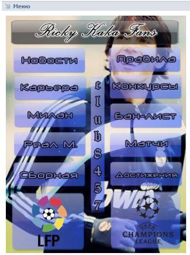
An example of a good and attractive menu.

Depending on the niche, the wiki menu may contain the following sections
- if this is a sale of individuals. goods and services - delivery conditions, product categories, price lists, how to order, description, etc.
- if the sale of information products
is a structured content base, such as
Another example of a good menu:

Links
In the links, indicate all your external resources - lead magnets, main sites, channels on other social networks where the audience will go. This will help increase traffic to your resource from social networks.

Read also>>>>
Content is King
Content is King
Bill Gates once said and he was right. Social networks exist and are popularized due to the presence of constantly generated content on them. Without him, the group is burned out and forgotten about. Therefore, you need to post regularly to remind yourself.
But how to properly format posts so that they are liked and shared?
Everything is very simple here - you don’t need to use pictures with cheap design and dull copywriting in posts - not only do users not like them, the social network itself ignores this content format. This is roughly what the picture should look like.

Nobody demands design work from you, but only a design that is pleasant and not irritating to the eye. If the content is visually perceived well, then the likelihood of it being shared is high.
CHPS (Humanly Understandable Links) in posts
Try not to indicate original links or links with UTM tags, but shorten them using the service vk.com/cc in the title, under the post title. VK users ignore posts with long links (especially at the beginning). They are interested in content. Compress links in posts using vk. com/ cc
Here on specific example you can see how this link looks in the post:

Also try not to use obvious and trivial headings. The purpose of headlines is to attract the attention of community subscribers in news feed. For example, title "16+1 Effective and Medicinal Properties Pumpkin Seed Oil That 95% of People on the Planet Don't Know About" will work better to attract the attention of the audience than the nondescript “Properties of Pumpkin Seed Oil.” Try to add numbers and specifics to the title. Then the post will attract attention.
Are you ready to challenge your dream and realize your ideas and ideas on the Internet, and start making serious money online?
Diversify your content
Identify at least 30 topics (needs) that may be closely related to your direction and use a timer to start posting.

Create interesting content about your niche. For example, in the topic of sports, you can write motivational content, educational and expert content. The list of needs can be made endless and the problem is choosing a format so that posting by itself will disappear. In each post, use different calls to action with justification for the reason - “Like it if it was useful”, “Repost if you think all your friends should know about it.”
Add emoji to your posts to make them more colorful and attractive. But don't overspam.

Find out
Video
In all videos uploaded to YouTube, insert a cover so that there is packaging and wrapping that will catch the user’s attention. Videos without a wrapper look very crude, in which it is already clear that there will be no interest in downloading them.
Here's an example of what a video cover should look like:

The click-through rate of a video with a cover is many times higher, because there is packaging - a wrapper that attracts the audience. The picture should play its role – arousing interest in what’s inside.
Implement!
Goods
Products section - prices are indicated in ascending order - the lowest prices should be on the display.

Detailed description in the product card itself. And if there is a website, add a link to the product card. The “Write to the seller” button is linked to personal messages from the person who leads the group, or the manager who monitors the group

We're reaching out to the community
We fill out the discussion section and create subsections in it - “Your questions”, “How to order”, “Vacancies”. You can also create a questionnaire for variety.

Don’t forget to fill out your contact details too. So that a person understands who to contact - regarding ordering goods, advertising or your services.
To understand who to ask a question, write down the position - manager and the person’s responsibilities. This way you will quickly let the user know who he should contact with his question.

The most important thing, I almost forgot :) - filling in the group description necessary information with all outgoing links. Be sure to separate the description into blocks of text of 3-4 lines so that the text is readable - no one has yet canceled the copywriting rules for text readability.
Here is an example of how well a description in a community should be:

P.S.
Well, what do you say? Was the content helpful?
Do you understand how to create a group on VKontakte?
If yes, then I'm waiting feedback in the comments - I answer instantly. You won't have time to blink. I like to discuss the topic of promotion in social networks. If I don’t have time, then write
The goal of the creator of a group on social media. networks to attract more visitors. It is important that the guest wants to join, sign, read information, leave a comment or order a product. The need for the final result differs from the direction of activity.
The first seconds of stay form further actions guest. This is why the interface plays a big role.
Factors that leave a guest:
- avatar;
- description;
- Name;
- beautiful and practical menu;
- colorfulness;
- content.
It’s easy to create a practical menu that motivates more than just action. But first you need to figure out what it should be.
What should the menu be like?
Using a well-designed menu, the visitor can easily navigate through it and quickly get answers to their questions. Navigation also allows you to create the right impression of the project.
Three main goals of groups:
- sales;
- increase in traffic;
- increase in active visitors.
For sales, group navigation replaces in-store display.

The most important buttons should be here:
- catalog;
- price;
- delivery;
- promotional offers;
- reviews.
To increase traffic, the emphasis is on the content and flavor of the site or blog.
An approximate set of buttons:
- interesting articles;
- useful information;
- subscribe;
- reviews.
To increase the activity of participants, you should stimulate them with promotions, surveys and interesting and unusual content.
We offer the following buttons:
- subscribe to news;
- ask an interesting thematic question;
- stock;
- questionnaire;
- vote.
Let's look at how to create a menu for a group in contact, that's all technical points that require minimal knowledge graphic editor and the basics of working with VKontakte.
We create in stages
Creating navigation is an interesting, complex and lengthy process. But the result is worth it.
The whole process is divided into 2 stages:
- working with photoshop;
- technical addition.
video: menu for public
Working with Photoshop
Before you begin, you need to visually visualize the design or general view, as well as its components. No special knowledge is required, just follow the steps of the instructions.
Algorithm of actions:
- install and launch the Photoshop program;

- in the “File” item, select “Create”;
- in the window that appears, set:

This is done using the Rectangular Marquee tool:

Working with graphics:

It should look something like this:
Save the rectangle located on the right as a separate image, setting the size to 200x500 pixels. This is a ready-made avatar, uploaded through the “Upload photo” button in the VK group.

The second picture still needs to be divided by the number of points. This is done in order to assign a link to each button.
First you need to make the markup:

Create fragments:

Saving images:

How to clean your computer from unnecessary programs? Instructions here.
Technical part
Finished images must be transferred to the group. By following the steps below, this task can be easily completed.
Important! Uploading a menu differs from usually uploading photos or pictures.
Everything in order:

Now the most important thing is why all this was done. Add menu functionality. A separate image must be assigned its own link.
- find the required entry;
- left-click on it;
- copy the URL in the address bar.
- go to the source where you need to transfer the visitor;
- copy the required address.

Save the changes using the corresponding button at the bottom of the window.
Attention! Changes may not be reflected immediately. It is recommended to log out to your main profile and then log back into the group.
How to create a menu in a VKontakte group wiki markup
Wiki markup is special language, used to design web pages in social network groups.
This tool allows you to create:
- effects;
- unusual menus;
- signs;
- navigation elements;
- format text.
In a word, this markup allows you to create a mini VKontakte website. This is very convenient, especially for sales and recruiting subscribers.
This design intuitively forces the visitor to stay and click on the button. That is, it delays and stimulates action - and this is exactly what is needed.
Visually, such a system is very similar to HTML layout. But it does not require long training and a special mindset.
Video: menu with search by category
Nuances of creation
Actually, what was done above (dividing and loading the image) are already markup elements. This is the advantage of this tool. Automatic transformation into tags when simply loading images.
However, it is important to know the individual tags that help you do more more features and beauty. For example, when we fill individual parts of the image, white stripes may form between them. You can remove them by simply adding the noborder tag.
Like this: []
The main tags are presented in the table below:

Working with pictures
[] .
Where options is replaced with:
- noborder- removing the frame around the image;
- nopadding- removing spaces between images;
- plain- insert a link to the image. Designed as text, without graphics;
- nolink- removing the link to the picture;
- box- opening an image in a window;
- NNNxYYYpx or NNNpx- sets the photo size in pixels.
Creating a table
Regardless of what kind of menu (text or graphic) you create, you are unlikely to do without inserting a table. Otherwise, you can just paste the text into the news field and not format it, wasting so much time.
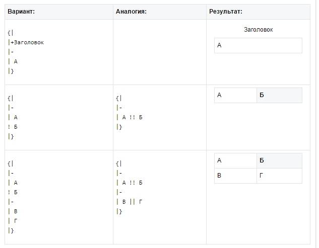
A table is created using a special set of characters, where each of them is responsible for a specific part of the table:

In this article we will look at how to beautifully and correctly design a group in contact so that it is as convenient as possible for visitors.
Consider, how to beautifully and correctly design a VK group we will not be from a design point of view, but from the point of view of the goals that the group faces.
The main goal of any group– to win over the visitor so that he immediately understands what the group is about and wants to become a member. To make the group as convenient as possible, you need to minimize the number of actions on the part of the visitor. That is, ideally, for the user to understand what the group is about, he should not make any additional clicks or scroll the page.
In order to figure out how to properly structure a group in contact, let’s look at its structure according to its main elements.
I have prepared a special visual diagram with explanations.
A diagram of how to beautifully and correctly organize a group in VK.
You can see the diagram live follow the link.
1. Avatar.
The main graphic element of the group. Its structure may vary depending on the topic of the group. One example suitable for a sales group is shown in the diagram. Key recommendations for avatar design:
A) Conveying the essence. The main purpose of an avatar is to convey key features group, tell what it is about and for whom. Not only the picture itself, but also the text inscriptions will help you with this. However, it is advisable to keep the text as small as possible.
B) High quality image. The graphics should be of high quality and beautiful, but nothing more. The avatar should not distract excessively from the main content.
IN) Use every possible space. Maximum size avatars at the output are 200 by 449, it is not advisable to do less. If you do more, then maintain the proportions.
2. Group status.
Despite the fact that this is a relatively small page element, it is quite important. The status should briefly convey the most significant information about your group. The maximum length of a status is 140 characters.
Try to make the status as clear and local as possible. Use icons. Icon codes for insertion can be found, for example, .
Examples of icon codes for selling groups:
Phone - code: _9742;
Icon send message code: _9993;
Pointer - code: _128073; or code: _10145;
3. Description of the group with a menu or pinned post.
Below the status in the very center of the page is the main content. There are 2 main options for what can be in the content. This is a description of the group with a menu and a pinned post from the wall.
The menu is quite convenient in terms of navigation, but requires an additional click to expand, so we will not dwell in detail on creating a menu for a group. Materials on the topic wiki markup there are plenty on the net.
For computer version In our opinion, it is better to make a pinned post the main content of a group, since it can take up the entire usable area, is quite convenient and does not require additional clicks from the user.
General guidelines for creating a pinned post:
A. The main text should be as easy to read as possible. Make heavy use of icons and badges.
B. The total height of the pinned post should not go beyond the bottom border of the avatar. Experimentally, you can select the optimal amount of text content.
B. The recommended size of the attached picture is 395 by 289. These sizes are optimal for placing key information in it.
In addition to the main elements, there are also others that are no less significant, namely: group wall, discussions, albums, videos, documents and contacts.
These elements are essentially group content. Content– this is the main reason why a visitor subscribes to the group. Content should be formatted according to the group's basic style. But the design is not so important as the content of the content itself.
If the group is empty and, apart from the design, does not contain anything valuable, it is unlikely that anyone will subscribe to it. We will not write in detail about the content in this article. An article about how to beautifully and correctly design a VKontakte group. If you need help writing content, you can contact us as part of the “ ” service
That's all for today regarding group design. Write your questions about the article in the comments below.
For questions about ordering services, write to icq 275129,