How to round corners in CSS and HTML. Rounding corners of pictures. Rounded corners using CSS
Please note that the CSS styles for a given shape are entered into the file once, but the HTML tag can be placed an unlimited number of times on the site.
As a result of the output we get the following rectangle with frame.
How to Make Rounded Corners in CSS
The attribute is used to round corners border-radius.
We could add just this attribute. It normally displays the rounding result in new versions of browsers, but many users still have older versions where this attribute does not work correctly. Therefore, for compatibility, we will add a few more descriptions of this attribute, which is tied directly to certain browsers, into our block in the Style.css file, resulting in the following code:
The HTML div tag will give us rectangle in frame with roundedand corners:
and the HTML tag for displaying the text will look like this:
|
pib9.ru
|
We get rounded rectangle and text: 
If you remove the rectangle size description attributes from the code width And height, then you can get the following shapes with rounded corners:
1. No text
In this case, the forms take on the dimensions of the environment: the length corresponds to the width of the field, and the height changes as the form is filled with content.
Round selected corners
In the style description, the 10px parameter in the attribute border-radius shows the radius of curvature, which can be changed by selecting the one you need. If set to 0, rounding will not occur. This property can be used when you need to round selected corners.
Let's write down the values of the rounding radius for each corner, indicating zeros where we cancel the rounding. For example, let's cancel the rounding in the third and fourth corners. Our code will look like this:
1. Upper left corner.
2. Upper right corner.
3. Bottom right corner.
4. Lower left corner.
This results in a rectangle with selected curves only in the upper corners.
Angles are counted clockwise, starting from the upper left corner: 
2. Rounding corners using HTML code without writing to a style file
Consider the second method of obtaining a rectangle with rounded corners with using HTML code without writing to a style file.
HTML rounded corners
There is one small feature that simplifies the whole process even more - this HTML rounded corners. It consists in generating HTML code, which contains the same styles as in CSS codes. This uses the same attributes as in the CSS block and eliminates the need to write the block to the Style.css file. In a word, we completely replace the CSS code with HTML code.
Instead of our CSS block, we get an HTML script, which we insert into the place where the rectangle with rounded corners should appear:
The first method of rounding corners can be used when the same shape is used more than once without changing styles. The second method is used for forms whose styles are used once.
3. Pictures with rounded corners. Frame around HTML image
I also want to give you useful information. Often using pictures for website design, I really want to make them even more beautiful by changing their shape, framing them with a frame of a beautiful color and different widths. This raises the question: “ How to round the corners of a picture?”.
This is done very simply, and now we will learn how to do it.
Let's place the image on the site, making it its own background as the background of the div tag. We get the following code and image:

Rounding the corners of the picture by adding a frame
Rounding the corners of images in CSS and HTML and adding a border can be done in one of the two ways described above.
Using the first method in this article, the image codes for the stylesheet file and the HTML div tag will look like this:
Please note that some attributes can be entered into the style file, and some into the div tag. In our case, the image dimensions width and height are inserted into the HTML code.
The HTML code of the second method, without using the style file described in this article, looks like this:
As a result of the codes of each of the two methods, we get the same result - a picture with rounded corners:

Everyone has long been tired of traditional rectangular corners in website design. Rounded corners are in fashion, which are made not using images, but through styles, for which the border-radius property is used. This property can have one, two, three or four values separated by a space, which determine the radius of all corners or each individually.
In table 1 given different quantities values and the type of block that is obtained in this case.
| Code | Description | View |
|---|---|---|
| div ( border-radius: 10px; ) | Rounding radius for all corners at once. | |
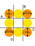
| div ( border-radius: 0 10px; ) | The first value sets the radius of the top left and bottom right corners, the second value sets the radius for the top right and bottom left. |  |
| div ( border-radius: 20px 10px 0; ) | The first value sets the radius of the upper left corner, the second - both the upper right and lower left, and the third value - the lower right. |  |
| div ( border-radius: 20px 10px 5px 0; ) | Sequentially sets the radius of the upper left, upper right, lower right and lower left corners. |  |
Example 1 shows how to create a block with rounded corners.
Example 1. Corners of a block
HTML5 CSS3 IE 9+ Cr Op Sa Fx
The result of this example is shown in Fig. 1.

Rice. 1. Block with rounded corners
An interesting effect can be obtained if you set the rounding radius to be greater than half the height and width of the element. In this case, you will get a circle. Example 2 shows how to create a round button with a picture.
Example 2: Round button
HTML5 CSS3 IE 9+ Cr Op Sa Fx
The result of this example is shown in Fig. 2.
Rice. 2. Round button
IN Opera browser rounding to
The border-radius property can be combined with other properties, for example, adding a shadow to an element. In example 3, a set of circles is made, one of which is highlighted using box-shadow . This set can be used to navigate through pages or photos.
Example 3. Glow
HTML5 CSS3 IE 9+ Cr Op Sa Fx
The result of this example is shown in Fig. 3.

Rice. 3. Glow around the circle
Using border-radius you can create not only a circle, but also an ellipse, as well as an elliptical rounding for a block. To do this, you need to write not one value, but two, separated by a slash. Writing 20px/10px means that the horizontal radius of the fillet will be 20 pixels, and the vertical radius will be 10 pixels. Example 4 shows how to create elliptical corners to add a comic-book style caption to a photo.
Example 4: Ellipses
HTML5 CSS3 IE 9+ Cr Op Sa Fx

The result of this example is shown in Fig. 4.

Rice. 4. Using elliptical corners
You can also change the appearance of the corners on images by adding the border-radius property to the img selector, as shown in Example 5.
Example 5: Images
HTML5 CSS3 IE 9+ Cr Op Sa Fx


CSS3 frame complements the ability to format element borders with properties that allow round the corners element, and also use images to design the borders of the element.
Rounded corners and picture frames
1. Rounding corners with border-radius
Browser support
IE: 9.0
Firefox: 4.0
Chrome: 4.0
Safari: 5.0, 3.1 -webkit-
Opera: 10.5
iOS Safari: 7.1
Opera Mini: —
Android Browser: 4.1
Chrome for Android: 44

The property allows you to round the corners of lowercase and block elements. The curve for each angle is defined using one or two radii defining its shape − circle or ellipse. The radius applies to the entire background, even if the element has no border, the exact position of the secant is determined using the background-clip property.
The border-radius property allows you to round all corners at once, and using the border-top-left-radius , border-top-right-radius , border-bottom-right-radius , border-bottom-left-radius properties you can round each corner separately .
If you set two values for the border-radius property, the first value will round the top left And lower right corner, and the second - top right And bottom left.
Values specified through / determine horizontal And vertical radii. The property is not inherited.
Options
Div (width: 100px; height: 100px; border: 5px solid;).r1 (border-radius: 0 0 20px 20px;).r2 (border-radius: 0 10px 20px;).r3 (border-radius: 10px 20px ;) .r4 (border-radius: 10px/20px;) .r5 (border-radius: 5px 10px 15px 30px/30px 15px 10px 5px;).r6 (border-radius: 10px 20px 30px 40px/30px;) .r7 ( border-radius: 50%;).r8 (border-top: none; border-bottom: none; border-radius: 30px/90px;).r9 (border-bottom-left-radius: 100px;).r10 (border -radius: 0 100%;).r11 (border-radius: 0 50% 50% 50%;).r12 (border-top-left-radius: 100% 20px; border-bottom-right-radius: 100% 20px ;)  Rice. 1. Examples of various options for rounding block corners
2. Border-image
Browser support
IE: 11.0
Firefox: 15.0, 3.5 -moz-
Chrome: 16.0, 7.0 -webkit-
Safari: 6.0, 3.0 -webkit-
Opera: 15.0, 11.0 -o-
iOS Safari: 7.1
Opera Mini: 8 -o-
Android Browser: 4.4, 4.1 -webkit-
Chrome for Android: 42
The property allows you to set an image as the element's frame. The main requirement for the image is that it must be symmetrical. Property includes following values: (border-image: width source slice repeat outset;) .
With the help of this simple image You can get these frames for an element.
/* Example 1 */ div ( width: 260px; height: 100px; border-style: solid; border-image-width: 15px; border-image-source: url(border_round.png); border-image-slice: 30 ; border-image-repeat: stretch; ) /* Example 2 */ div ( width: 260px; height: 100px; border-style: solid; border-image-width: 15px; border-image-source: url(border_round. png); border-image-slice: 30; border-image-repeat: round); 


 Rice. 2. An example of designing block boundaries using an image
Cuts A - B - C - D form the corners of the frame, and the part of the design located between them fills the remaining space of the frame in accordance with given value border-image-repeat properties. Corner size (in in this example this is the number 30) is specified using the value of the border-image-slice property.
2.1. border-image-width
The property specifies the width of the image for the element's border. If the width is not specified, it defaults to 1.
| border-image-width | |
|---|---|
| Values: | |
| length | Sets the border width in length units - px / em . You can set from one to four values at a time. If one value is specified, then the width of all sides of the frame is the same, two values specify the width of the top-bottom and right-left, etc. |
| number | The numeric value by which the border-width value is multiplied. |
| % | The width of the element's border is calculated relative to the size of the image. Horizontal relative to width, vertical - relative to height. |
| auto | Corresponds to the border-image-slice value. |
| initial | |
| inherit | |
Syntax
Div (border-image-width: 30px;) Fig. 3. An example of setting the width of an image frame using various types values
2.2. border-image-source
The property specifies the path to the image that will be used to decorate the block boundaries.
Syntax
Div (border-image-source: url(border.png);)
2.3. border-image-slice elements
The property determines the size of the image parts used to define the borders of the element and divides the image into nine parts: four corners, four edges between the corners, and a central part.
| Values: | |
| number | The size of the frame parts can be set using one, two, three or four values. One value sets the borders to be the same size on each side of the element. Two values: the first determines the size of the top and bottom borders, the second - the right and left ones. Three values: the first determines the size of the top border, the second - the right and left, and the third - the bottom border. Four values: Defines the sizes of the top, right, bottom, and left borders. The numeric value represents the number of px. |
| % | Border sizes are calculated relative to the image size. Horizontal relative to width, vertical - relative to height. |
| fill | The value is indicated along with a number or percentage. If specified, the image is not cut off by the inner edge of the frame, but also fills the area inside the frame. |
| initial | Sets this property to its default value. |
| inherit | Inherits the value of this property from the parent element. |
Syntax
Div (border-image-slice: 50 20;)  Rice. 4. An example of specifying image frame slices
2.4. border-image-repeat
This property controls how the background image fills the space between the corners of the frame. Can be specified using either a single value or a pair of values.
Syntax
Div (border-image-repeat: repeat;) Fig. 5. Example of repeating the central part of an image frame using different types of values
2.5. border-image-outset
The property allows you to move the image frame beyond the borders of the element by a specified length. Can be specified using either one or four values.
Syntax
Div (border-image-outset: 10px;)  Rice. 6. An example of shifting an image frame using different types of values
3. Outer frame offset outline-offset
The property specifies the distance between the border element's border and the outer border created using the outline property.
/*Figure 1:*/ img ( border: 1px solid pink; outline: 1px dashed gray; outline-offset: 3px; ) /*Figure 2:*/ img ( border-width: 1px 10px; border-style: solid; border-color: pink; outline: 1px dashed gray; outline-offset: 3px; Rice. 7. An example of decorating an image with an outer frame
 4. Gradient frame
The value of border-image can be not only an image, but also gradient fill.
Translucent frame
One of the colors is transparent . In this way, you can set boundaries for all sides of an element at once or separately for each side. The thickness of the border is controlled by the border-width property.
Postal envelope
Good morning, afternoon, evening or night everyone. Dmitry Kostin is with you again and again. Somehow I was looking through different pictures and then I liked some of them. And they liked them because they had rounded edges. It immediately looks more interesting. Don't you think so? And that’s why in today’s lesson I would like to tell you how to round corners in Photoshop to make the photo look more interesting.
What I love about Photoshop is that in many cases the same thing can be done in several ways. So it is here. Let's get started with our photoshop.
Antialiasing using edges
This method is similar to the previous one, but still very different. We will do everything with the same image.

By creating a shape
The third method is already radically different from the previous two. So take a break for a couple of seconds and move on. I won’t change the image and will load this car into Photoshop again.

Do you see what you ended up with? The picture now has rounded edges, and all because it is displayed only where our drawn one is located. rounded rectangle. But now you can crop out the extra photo using the Frame tool, or you can immediately save the picture and you will already have a separate image with rounded corners.

Try to do everything yourself, and at the same time tell me which of the presented methods is more preferable to you.
And by the way, if you have gaps in Photoshop or you just want to fully learn it in the shortest possible time, then I highly recommend that you watch one great photoshop course for beginners. The course is well done, everything is told and shown just great, and each material is discussed in great detail.
Well, I’m finishing my lesson for today. Don't forget to subscribe for new articles and share this with your friends. I was glad to see you on my blog. I'm waiting for you again. Bye bye.
Best regards, Dmitry Kostin
All modern browsers support standards hypertext markup HTML5 and CCS3 styling. And if your site (template) supports modern standards, then you can make changes to the design, such as rounding corners, shadows, gradient fills, without resorting to graphic editors.
Webmasters use it everywhere rounded corners in blocks and frames on websites. In this article I will tell you how to round the corners of pictures and photographs on the site without using third party programs, only using CSS.
In order for the examples given in the article to be displayed correctly on your screen, you must use the most latest versions browsers, FireFox, Chrome and those made based on them: Yandex.Browser, Amigo and so on.
Rounding corners of DIV blocks
According to the CSS3 standard, so that the block DIV had rounded corners, it needs to be styled border-radius, for example like this:
Border-radius: 10px;
For clarity, let’s draw two blocks with straight and rounded corners:
Block with right angles
Block with rounded corners
Rounding corners of pictures
By analogy with the example above, you can round the corners of images on the site, for example photographs. For clarity, let's round the corners for the photo from the page
Here is the image without CSS processing
And now with rounded corners:
Border-radius: 10px;
To make it really “beautiful”, let’s add some edging from the beginning...
Border-radius: 10px; border: 5px #ccc solid;
and then the shadows:
Border-radius: 10px; border: 5px #ccc solid; box-shadow: 0 0 10px #444;
The option below (rounded corners with shadow without border) looks very similar to a mouse pad:
Border-radius: 10px; box-shadow: 0 0 10px #444;
And finally, a complete mockery of the image
Border-radius: 50%; border: 5px #cfc solid; box-shadow: 0 0 10px #444;
If you open the image in a new window, you will see that it (the image) is unchanged, and all the corners, shadows, and so on are just the result of processing CSS styles by your browser.
A small lyrical digression
Style border increases the size of the image by the amount of the border. If a value is specified border: 5px, then the final image will become wider and taller by 10 pixels. Keep this in mind, in some cases the layout of the site may not work.
A style box-shadow does not affect the size of the picture, the shadow seems to run over neighboring elements. When using it, the site layout does not suffer.
How to Round the Corners of Images in WordPress
In all the examples above, I wrote styles directly in html tags code. For example, the last one looks like this:

This is good when you need to re-arrange one picture or photograph. What if you want to change everything? Well, you won’t climb all over your site to edit the display of each one. In most cases, WordPress tag IMG defines several style classes. One by the unique name of the image file, another by size, and another by alignment. You can supplement one of them with the above parameters.
For example, for all images for which alignment is not specified, in the file style.css yours WordPress themes write the following:
Alignnone ( border-radius: 10px; border: 5px #cfc solid; box-shadow: 0 0 10px #444; )
Or the most stringent method for all the pictures on the site. Let's redefine the style for all tags IMG:
Img ( border-radius: 10px; border: 5px #cfc solid; box-shadow: 0 0 10px #444; )
The last option is suitable not only for WordPress, but for any CMS. And even for simple HTML pages in the case when, when displaying images, the tag IMG no style classes are assigned. But be careful. If you override the tag display options IMG you will change appearance ALL the pictures on the site!
Instead of a conclusion
All examples in the article are conditional and are intended only to demonstrate some of the capabilities of CSS for image processing and show how simple it is.