Drawing a realistic seal. Create a realistic print effect in Photoshop
You have probably seen such seals on some websites or blogs. They are nothing more than fun. They look very natural, but still do not try to fake a real seal in this way.
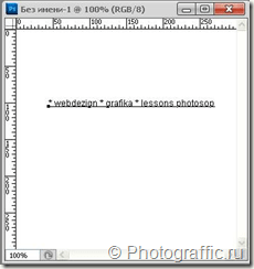
1. Create new document white color, 300px wide and 300px long.
2. Write text on the created document approximately in the middle in black Arial font, which will be located on the periphery of the future seal:
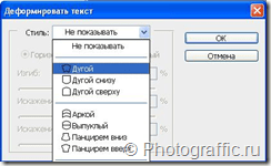
3. In the Text tool settings, click on the icon marked in red in the screenshot:
and in the window that opens, select the style of text deformation with an arc:
For this style, apply the following settings:

4. Now duplicate the text layer: Layer –> Duplicate Layer...
and apply the commands Edit –> Transform –> Rotate 180°
move the text layer so it looks like this:


5. For the outline of our seal, we will create new layer and select the “Ellipse” tool (Ellitical Marquee tool), you can also call it hotkey U. Use an ellipse to create an outline around the text. Select brush settings – diameter – 5px, hardness – 100%, color – black. Select the “ellipse” tool again, right-click anywhere in the document and select “Stroke path” -> brush.

6. Create the inner outline of the seal in a similar way. In the brush settings, change the diameter to a smaller one (2 px) and draw the outline as before.

7. Write the text that will be located in the inside of the future print and move it exactly to the center using the Move Tool.

8. In order to make the print impression more believable, you should apply any black and white texture and change the layer blending mode. For example, we can quickly create a texture ourselves. To do this, create a new layer. Apply the commands Filter –> Render –> Clouds. Add noise: Filter –> Noise –> Add Noise.
Very useful lesson for beginners, in which we will create a stylish grunge stamp with scratches and scuffs. To do this, we will write the word that will be on our stamp, make a stroke, add abrasion using the “Airbrush” filter, apply a texture with scratches in a special mode, use the “Levels” tool and slightly rotate the image.
Step 1.
Let's create a new document. Fill it with white. Use the Impact font, size 72 px, to write any word. The color is red. Right-click on the text layer and select “Rasterize Text.” 
Step 2.
On a new layer, select a rectangle slightly larger than the word itself. 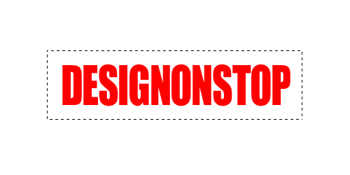
Step 3.
Fill this rectangle with red. Then in top menu select “Selection” > “Modification” > “Compress” and in the dialog box that opens, set the value to 5 pixels. 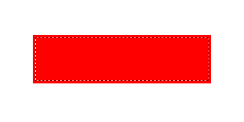
Step 4.
Delete the inner part of the rectangle. The result is a stroke for the text. Combine two layers: a layer with text and a layer with a stroke. 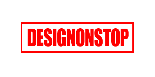
Step 5.
In the top menu, select “Filter” > “Strokes” > “Airbrush...”. We set the values as in the figure below. Attention! For those with CS5, you need to place a layer with, say, white color under the inscription and merge it together, then the filter will work. 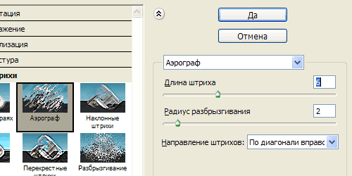
This is the result. 
Step 6.
Let's use a suitable texture with scratches. For example this one. 
Step 7
We insert the texture into our document. Change the blending mode to “Lighten”. 
Step 8
While on the texture layer, select “Image” > “Adjustments” > “Levels” from the top menu. By moving the white and black sliders, we set the values as in the figure below. 
This is the result. 
Step 9
While on the texture layer, press Ctrl+I to invert the image. Now we manually move the texture until we find a suitable part of the texture on which the scratches will fall in the most successful way. 
Final
You can reduce the texture layer's opacity to 85% and rotate the image slightly. 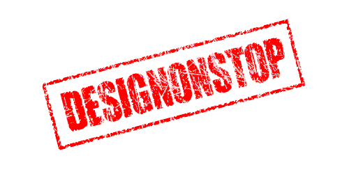
18.11.2014 27.01.2018
In this lesson you will learn how to draw a seal or stamp in Photoshop. The seal will be round, although it can be made triangular. You will learn how to print yourself, with your own data for the organization. Read the instructions below.
Note: This tutorial is not intended or intended to be a tutorial for creating fake seals for documents. The lesson teaches you how to create comic stamps for postcards or simply to decorate any images that are not documents. Do not violate the laws of the Russian Federation under any circumstances.
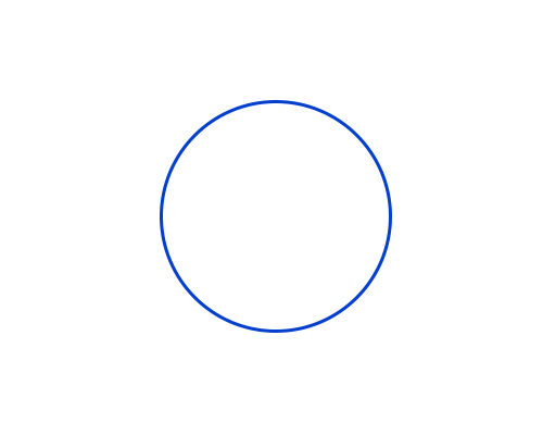
Create a circle for printing
The first thing to do is with transparent color inside, but with a 3 pixel blue stroke. Best blue for printing - #013fcd
To create a circle with an empty fill, but with a color stroke, use the tool Ellipse:

Tool settings in top panel look like this - the main color is transparent, the stroke color #013fcd
.jpg)
Now that the circle settings are set, draw a circle.
To do this, press SHIFT And Left Mouse Button. Next, drag the cursor to the side, creating a circle. This way you will get a perfectly even circle.
Duplicate the circle
Make a copy of the circle layer. To do this, select this layer and click CTRL+J.
A copy of the circle layer will appear. We will continue to work with him.

Change the stroke size of the new circle to 1 pixel.
Click CTRL+T to scale and make the circle smaller by holding down SHIFT+ALT(so that the circle decreases in proportion to the center).
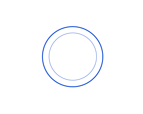
Great! We have prepared a frame for printing and a place for the inscription.
Adding an inscription for printing
Copy the last circle from thin stroke and make this copy of the circle’s stroke transparent - in fact, the circle will not be visible, but it will be on top of the original one. Next, activate the tool Text Tool to add a caption.

Hover your cursor over this circle (and you will see the cursor change, prompting you to add an inscription along the contour of the circle), click left button mouse and start writing.
Add the inscription you want, you can play with the size of the inscription so that it fits exactly the entire circle.
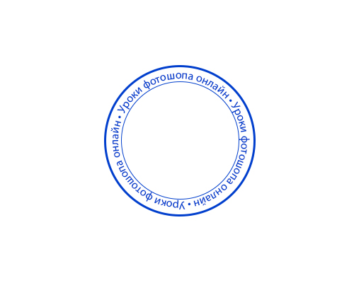
All that remains is to add the main inscription in the center.

Actually, a simple seal is ready. You can complicate and experiment as you wish, you understand the technique.
You can add a paper background for effect. It will be more beautiful and realistic if you twist the seal.
Create a stamp in PhotoshopI think that the master class on creating your own stamp will be useful to many.
Sometimes, for a change, you want to use something new rather than your “working” stamp. It occurred to me to try round stamp. The kind that most often appears on various important documents. I tried to describe all the steps so that even the person who opened the program could understand it Adobe Photoshop for the first or second time.
To get started, create a new document 600*600 (or 300*300) pixels. with a white background.
Select the T (text) icon on the toolbar
If you don't see the text, it means you have selected white. You can change the palette by clicking on this icon:
We write a small text about what we want to see on our seal. For me it's "Made with Love".
In the layers palette, select the layer with the text, then on the top panel click on the button with the letter “T” and an arc under it. Set the following values.

If you need to adjust the inscription to size, then select Edit-Transform-Scaling and do not forget to click on the “chain” icon so that you do not have incorrect deformation.

Copy the layer by pressing Ctrl+J and rotate the copy 180 degrees: Edit-Transform-Rotate 180. Move the copy so that it is located under the original.


We repeat the action. This time we make the circle smaller and the stroke 3px.

I also added handprints to my stamp. If you also want to make a stamp with handles, then select the tool " arbitrary figure", then on the panel at the top, click on the arrow next to the "free shape" tool and then select the desired element from all the presented shapes. In in this case right and left hand. To prevent them from merging, I reduced the opacity. If you wish, you can choose a different color altogether and then we will have them in a different color.

Press Shift+Ctrl+N to get a new layer and write on this layer required text. If the text is not written, but an existing inscription is selected, then we rasterize the layers (to do this, right-click on the layer with the inscription and select “Rasterize layer”) and only then write the text.

Rasterize the layer again. Now select all layers except the very last one (“background”) and connect them together by pressing Ctrl+E.
For greater realism, add noise: Filter - Noise - Add Noise

As a result, we get this print:

If desired, it can be
Rotate at the angle we need using Edit - Transform - Rotate,
You can print and use in your work,
Or you can make a brush from the resulting stamp to put an “imprint” of the stamp on your photographs.
To do this, we return in history to the steps before adding noise (if you use a stamp on a photo of your work, the noise will not look very good), then remove the background.
Really quick and easy to make, this stamp effect is great for adding texture to your work.
Tools
- Illustrator (Adobe Illustrator);
- Photoshop (Adobe Photoshop);
- monochrome design to which we will apply the effect (1);
- additionally: cool pattern
- rubber stamp for visual aid(take a look at ourif you like).
(1) The effect can be used for a multi-color image, just repeat the process separately for each color layer, since the effect is based on desaturation.
Instructions
First step
Open Illustrator. Create a square canvas, about 4000-6000 pixels on a side. In the example we will work with text, but you can use anything: lettering, icon or illustration.

Select your image and open the menu Effects → Distort and transform → Coarsening… (Effect → Distort & Transform → Roughen…) Use our settings as an example, but don't be afraid to experiment with the values yourself to achieve the best results.

Do not check the box Relative- the result is strange.

We didn't make the effect too expressive - just to show the uneven filling of ink along the edges of the stamp.
Now let's open our mockup in Photoshop to add texture.
Adding texture
Rubber stamps never produce a uniform print. This, together with the fibers that make up the paper, creates a lovely natural texture. We will reproduce it using a photograph of a concrete wall. Recesses and grooves on the surface of concrete are perfect for our effect.
This is the texture we chose on the website Textures.com:

Once you have decided on the texture, launch Photoshop and create a new large canvas. Upload your layout via the menu File → Place related… (File → Place linked…) and place the concrete texture on top. Hold Alt/Option and place the cursor between the layers on the tab Layers. You will see this symbol:
Click the mouse and the layer with the concrete texture will be cropped along the text boundaries:

Now we need to desaturate the concrete texture using the tool Hue/Saturation (Hue/Saturation). You can find it in the tab Window → Correction (Window → Adjustments) or by clicking on the icon in the window Layers(Layers). Install Saturation (Saturaion) on -100 .
Now the small dots and blotches that are supposed to create our stamp texture are the dark areas in the image. We need to get the reverse picture, so select Invert(Invert) in the tab Adjustments (Adjustments), and place this layer on top of the others.
Now add a layer Brightness/Contrast (Brightness/Contrast) from the same tab. Set value Contrast (Cotrast) on 90 , and play with the value Brightness (Brightness). The higher the brightness, the sharper the texture.

Your layout should look something like this.
You can stop here, but we'll add a couple more steps to complete the effect.
Ink tends to pool around the edges of the rubber stamp. This creates an inner shadow effect. To achieve a similar effect, right-click on the text layer and select Blending Options (Blending Options). Check the box Inner glow (Inner Glow) and set the settings as in the example below:

The effect is turned off in this screenshot Invert (Invert) so that you can better see the effect of the effect Inner glow (Inner Glow).

Finishing the job
Turn your effect back on Invert, and you're ready for the final step. First we roughened the edges of our text. This was done to show the uneven filling of ink around the edges of the stamp. Now we will enhance this effect. We have already described this technique in the logo creation guide ( picture 16).
Select the layer with your design and open the menu Filter → Blur → Gaussian Blur y ( Filer → Blur → Gaussian Blur). We set the blur radius to 6 pixels, but you can adjust it depending on the size of your canvas. Select a value to suit your taste and look at the result with pride.

Looks great! All that remains for you is to prepare your file for convenient use. Right now you have an awkward mess of layers, and in our next article we'll show you how to turn it into a reusable mess. action, so subscribe so you don't miss out.
Adding a pattern
Our font work looks quite lonely, so we added a special pattern.

Ready!
Subscribe to "". This is a weekly newsletter from the editor-in-chief. best links for graphic designers.